The Case for Data Thinking in the SOC
Posted on 09 April 2025
TweetIntroduction
Security Operations Centers (SOCs) have evolved beyond reactive log monitoring. In 2025, the emphasis is on data fluency, automation, and executive visibility. This transformation is driven by data-centric strategies and the adoption of Business Intelligence (BI) tools such as Metabase, Power BI, and Kibana.
This post explores how SOCs can leverage BI tools to treat their telemetry as valuable business assets, rapidly deploy dashboards, and enhance both executive insight and analyst efficiency.
TL;DR: Modern SOCs are not just responding to threats—they’re leveraging data for reporting, optimization, and proactive defense.
Bridging the Gap: Technical Insights to Executive Understanding
A common challenge in security teams is the disconnect between technical data and executive comprehension. While analysts delve into tools like QRadar or Splunk, executives often seek answers to questions like:
- How has our security posture improved over the past month?
- Where are we experiencing the most alert fatigue?
- Are our mean time to detect/respond (MTTD/MTTR) metrics improving?
BI tools address this gap effectively. Platforms like Metabase, Power BI, and Kibana enable the translation of complex SOC metrics into business-relevant insights. For instance, executives can access dashboards that present trends, KPIs, and performance indicators in an easily digestible format.
Automation and Integration Capabilities
One of the key strengths of BI tools in a SOC environment is their ability to consolidate data from various systems—SIEMs, SOAR platforms, CTI feeds, and ticketing systems—into a single, unified view. While the capabilities vary across platforms, the architecture typically follows a similar pattern.
Here’s how it generally works:
- Data Sources: QRadar, Splunk, SOAR tools, CTI feeds, vulnerability scanners, and more.
- Data Extraction: ETL pipelines or scripts (using Python, Logstash, or others) extract data via REST APIs.
- Data Warehouse or Database: The structured data is stored in a relational DB (e.g., MySQL, PostgreSQL) or in services like Azure SQL.
- BI Layer: Tools like Metabase, Power BI, or Kibana connect to the data warehouse and offer powerful visualization capabilities.
Note: Metabase (open-source) cannot directly connect to external APIs or SaaS services. You must first store the data in a supported database.
Power BI, on the other hand, supports both local and cloud data sources and offers native connectors for many APIs and Microsoft services.
Example Architecture: Power BI in a SOC Environment
The diagram below shows how various security telemetry sources (SIEM, SOAR, CTI, etc.) flow into a Linux server running ETL/data processing, which then feeds into a Windows server (running Power BI Desktop + Gateway), ultimately syncing with the Power BI Service on the cloud.
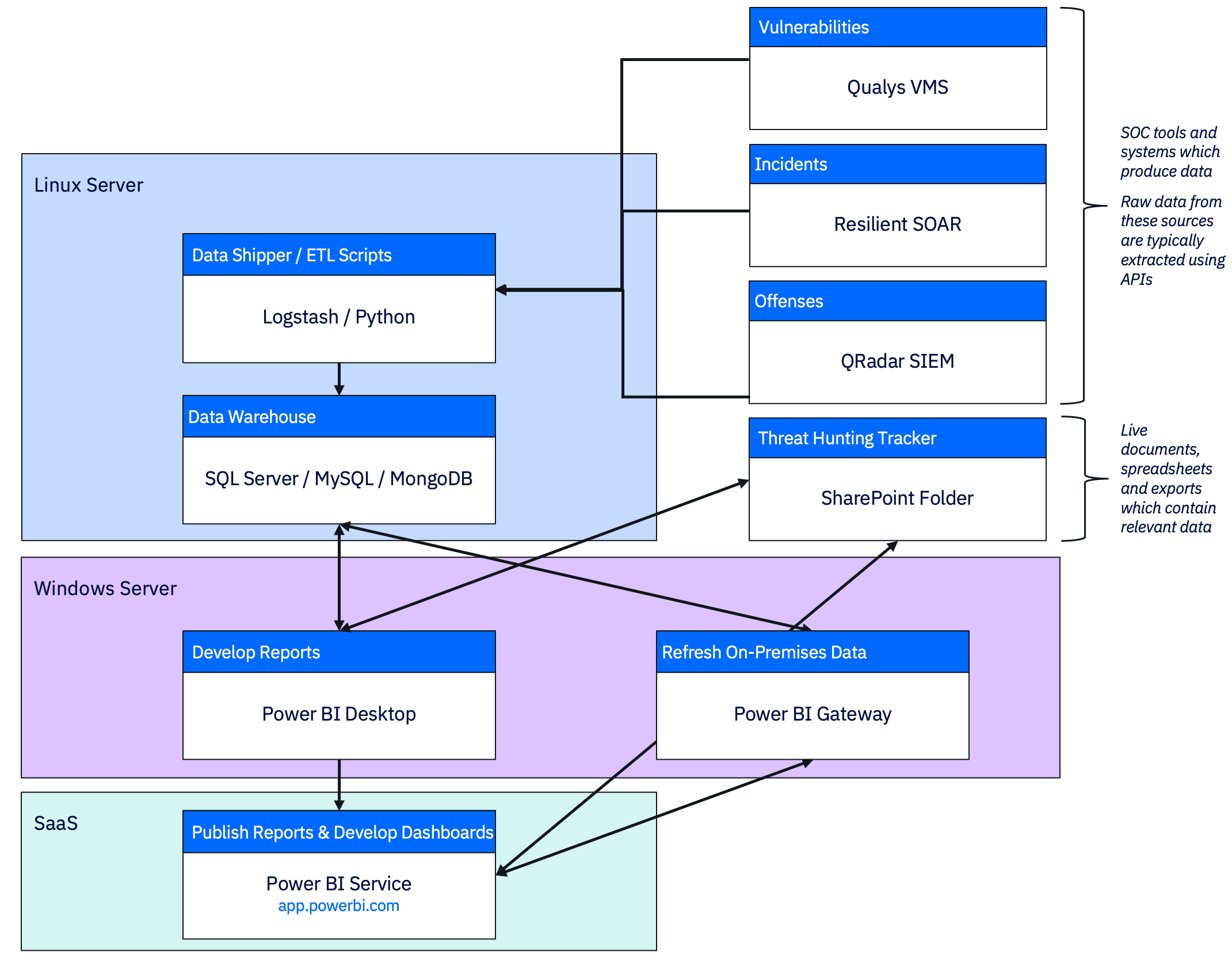
This structure supports:
- Flexible automation without relying on the BI tool itself for data ingestion.
- Modular design, so each component (ETL, DB, BI) can evolve independently.
- Hybrid deployments, where on-prem and cloud elements work together.
Whether you’re using Power BI, Metabase, or Kibana—the key is to establish a clean, consistent data pipeline. Once that’s done, building meaningful dashboards becomes exponentially easier.
Lightweight Deployment with Big Impact
You don’t need a sprawling infrastructure to adopt a BI solution—especially with Metabase. In fact, for smaller teams or PoCs, I’ve successfully deployed it on modest specs:
Sample Specs for Metabase (Small SOC):
- vCPUs: 2
- RAM: 4–8 GB
- Disk: 20–30 GB SSD
- OS: Ubuntu, Debian, CentOS
- Database: MySQL 8.0 or PostgreSQL 14+
Power BI may require tighter integration with Microsoft 365 or Azure for advanced features, while Kibana thrives where Elasticsearch is already in place.
Metrics That Matter
Business Intelligence platforms unlock a powerful opportunity for SOCs: the ability to track, interpret, and act on meaningful metrics. Below is a breakdown of essential metrics across SIEM, CTI, SOAR, and Analyst performance—along with their value and suggested visualizations.
SIEM Metrics
-
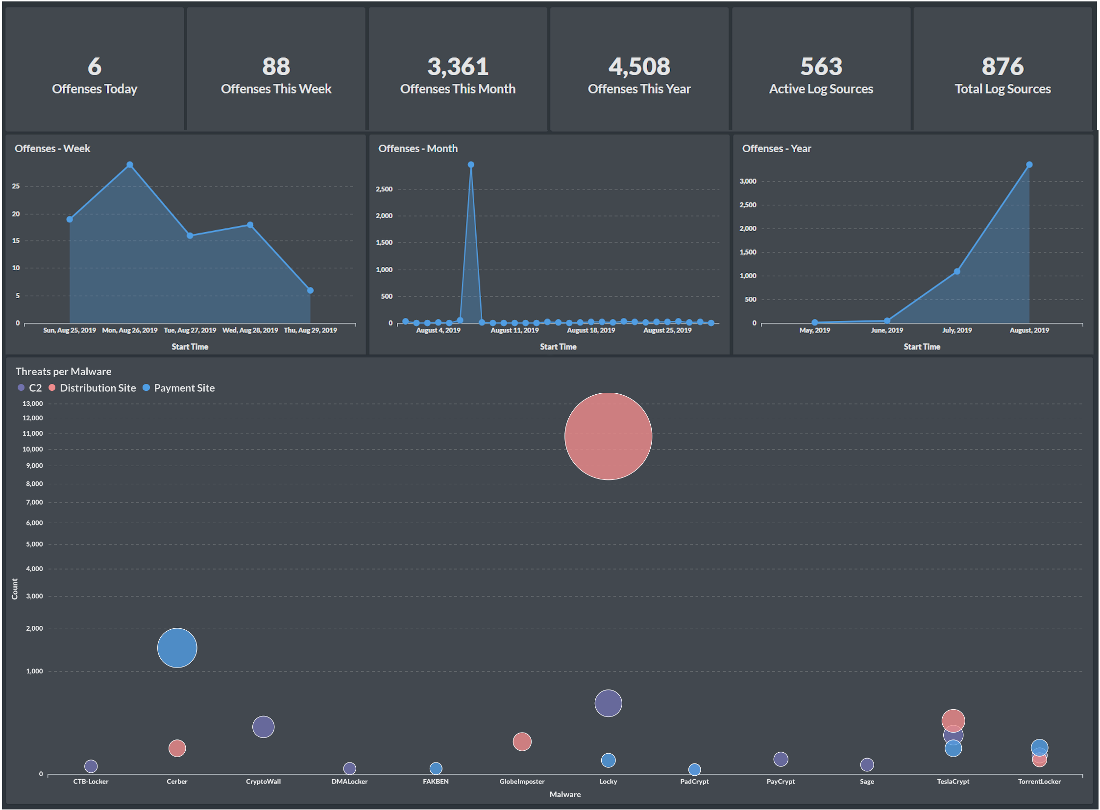
Offense Volume (Daily/Weekly/Monthly)
Measures the number of offenses generated over time. Helps in spotting unusual spikes or seasonality.
📊 Recommended Chart: Line chart, area chart -
Top Offense Rules Triggered
Identifies which detection rules are most frequently firing. Useful for fine-tuning rule logic and prioritizing tuning or threat hunting.
📊 Recommended Chart: Horizontal bar chart, Pareto chart -
Offenses by Severity / Magnitude
Shows distribution across low, medium, high severity incidents. Indicates threat landscape shift and response focus areas.
📊 Recommended Chart: Stacked bar chart, donut/pie chart -
Event-to-Offense Conversion Ratio
Compares raw log volume to actionable alerts. A low ratio could indicate noisy logs; a high one may reflect tuned detection maturity.
📊 Recommended Chart: Line or KPI gauge -
Time to Offense Escalation
Measures time between initial event ingestion and offense creation. Helps evaluate SIEM responsiveness.
📊 Recommended Chart: Boxplot or histogram -
Rule Utilization Rate
Percentage of enabled rules that have fired at least once during the period. Helps identify unused or redundant rules.
📊 Recommended Chart: Heatmap or bar chart
CTI Metrics
-
Number of IOCs Ingested vs. Correlated
Tracks how many indicators are being fed into the SOC vs. how many are actually linked to offenses or events.
📊 Recommended Chart: Side-by-side bar chart -
Threat Actor Mapping (MITRE ATT&CK Coverage)
Visualizes which tactics and techniques are seen in the environment. Supports purple teaming and control gap assessments.
📊 Recommended Chart: Matrix or radial chart -
Time from IOC Ingestion to Action
Measures operational agility in CTI response—from ingestion to detection/blocking.
📊 Recommended Chart: Line chart or time-to-resolution scatterplot -
IOC Expiry or Relevance Overlap
Tracks outdated indicators still in use. Useful for CTI feed hygiene.
📊 Recommended Chart: Time-based histogram -
Top Threat Families Observed
Groups correlated IOCs by malware family, actor group, or threat category.
📊 Recommended Chart: Treemap or bar chart
SOAR Metrics
-
Manual vs. Automated Response Ratio
Assesses the maturity and ROI of orchestration. High automation may correlate with faster response.
📊 Recommended Chart: Donut/pie chart or stacked column -
Playbook Success/Failure Rate
Measures reliability and effectiveness of automated workflows. Failures may indicate logic issues or integration gaps.
📊 Recommended Chart: Gauge, bar chart -
Average Actions per Alert
Quantifies playbook complexity and potential alert fatigue. Helps optimize playbook paths.
📊 Recommended Chart: KPI widget or histogram -
Time Saved Through Automation
Aggregates analyst time saved through automated steps—can support business value reporting.
📊 Recommended Chart: KPI card with cumulative trend -
Most Invoked Playbooks
Tracks usage frequency of individual playbooks. Informs reuse, improvement, and coverage.
📊 Recommended Chart: Bar chart or ranking list
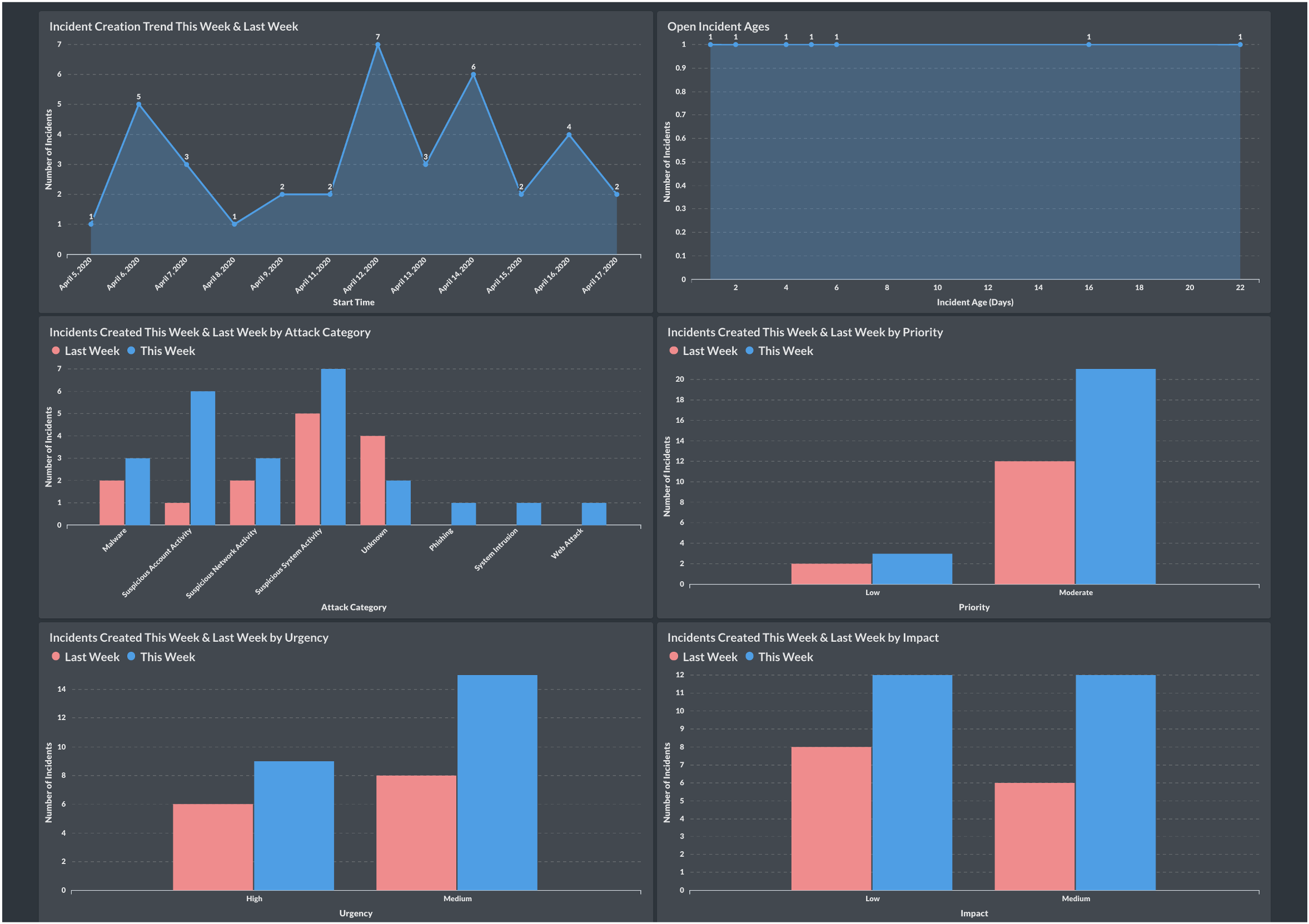
Analyst Metrics
-
Alerts Handled per Analyst per Shift
Measures productivity and helps balance workloads.
📊 Recommended Chart: Column chart or heatmap by analyst/team -
Mean Time to Detect (MTTD)
Tracks average time between threat entry and detection. Lower is better; goal is early visibility.
📊 Recommended Chart: Line chart with trend -
Mean Time to Respond (MTTR)
Measures how quickly incidents are resolved once identified. Key for evaluating SOC agility.
📊 Recommended Chart: Line chart or stacked timeline view -
False Positive Rate
Evaluates detection quality and alert fatigue. High rates may point to tuning needs or noisy data.
📊 Recommended Chart: Donut/pie chart with TP/FP/Unknown -
Case Reopen Rate
Tracks how often cases are reclassified or reopened—indicates review quality or rushed closures.
📊 Recommended Chart: Bar chart or KPI -
Escalation Ratio
Measures how many cases are escalated to higher tiers. Can reveal training needs or process friction.
📊 Recommended Chart: Funnel or flow chart
With the right BI tool and data architecture, these metrics go beyond reporting—they become decision levers. They inform tuning, staffing, tool effectiveness, and ultimately, the resilience of your SOC.
Future-Proofing: Laying the Groundwork for AI & ML
Once your security telemetry is centralized and structured (e.g., stored in MySQL or Elasticsearch), you’re already halfway to AI readiness. With consistent historical data, you can:
- Train ML models for anomaly detection
- Use regression to forecast alert trends
- Identify correlations or patterns at scale
- Enable AI-assisted alert triage or smart routing
This is the real power of data thinking: your dashboards evolve into decision engines—first for humans, then for machines.
Final Thoughts
The modern SOC needs more than log aggregation and alerting—it needs clarity, automation, and strategic visibility. BI tools like Metabase, Power BI, and Kibana make it possible to build these capabilities quickly and affordably.
- You don’t need an army of data scientists.
- You don’t need a premium SIEM add-on.
- You just need to start thinking like a data team.
Start small. Build iteratively. Measure what matters. And let the data speak.
Related Posts
If you found this post insightful, you might also enjoy these deep-dives into QRadar and BI integrations:
-
Quick QRadar Dashboards with Metabase BI
A beginner-friendly walkthrough on building QRadar dashboards using Metabase and its CSV upload feature. -
QRadar REST APIs with Logstash
A hands-on tutorial for setting up Logstash ETL pipelines that extract QRadar data using REST APIs and push it into various formats and destinations. -
QRadar REST APIs with Python
Practical Python scripts to interact with QRadar REST APIs for automation, data extraction, and reporting use cases using Jupyter Notebooks.