Pandas Data Analysis Tutorial: Ransomware Tracker
Posted on 19 July 2019
TweetIn this tutorial, we will learn how to use Pandas - a must-have Python module for Data Analysis and Data Visualization with a real-world example from the Cyber Security domain.
Note: Ransomware Tracker is no longer operational since 08 December 2019. It is still recommended that readers leverage the concepts and Jupyter Notebook available in this tutorial.
Introduction
Ransomware Tracker by abuse.ch is a website which tracks and monitors hosts and URLs associated with known Ransomware.
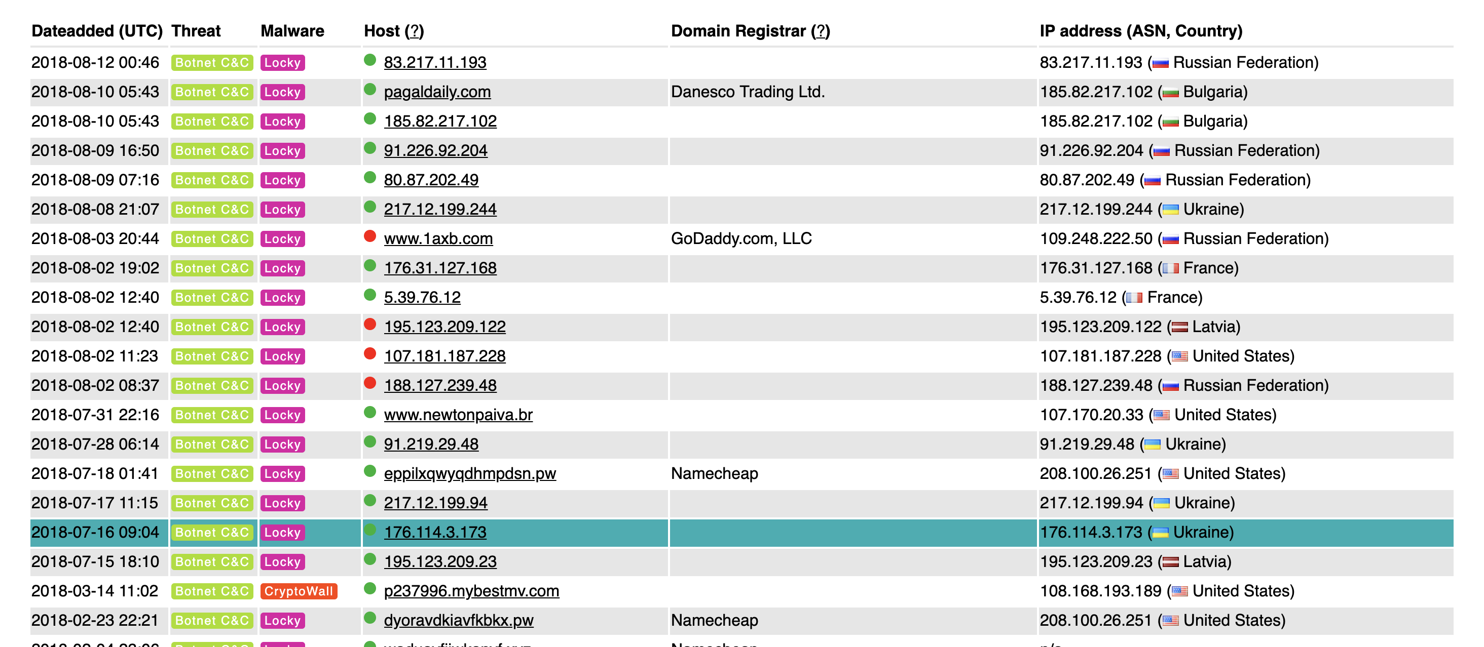
The website maintains a tracker which is frequently updated with threat intelligence associated with known Ransomware families. The screenshot below shows an interactive table on the Ransomware Tracker website populated with Ransomware threat intelligence.
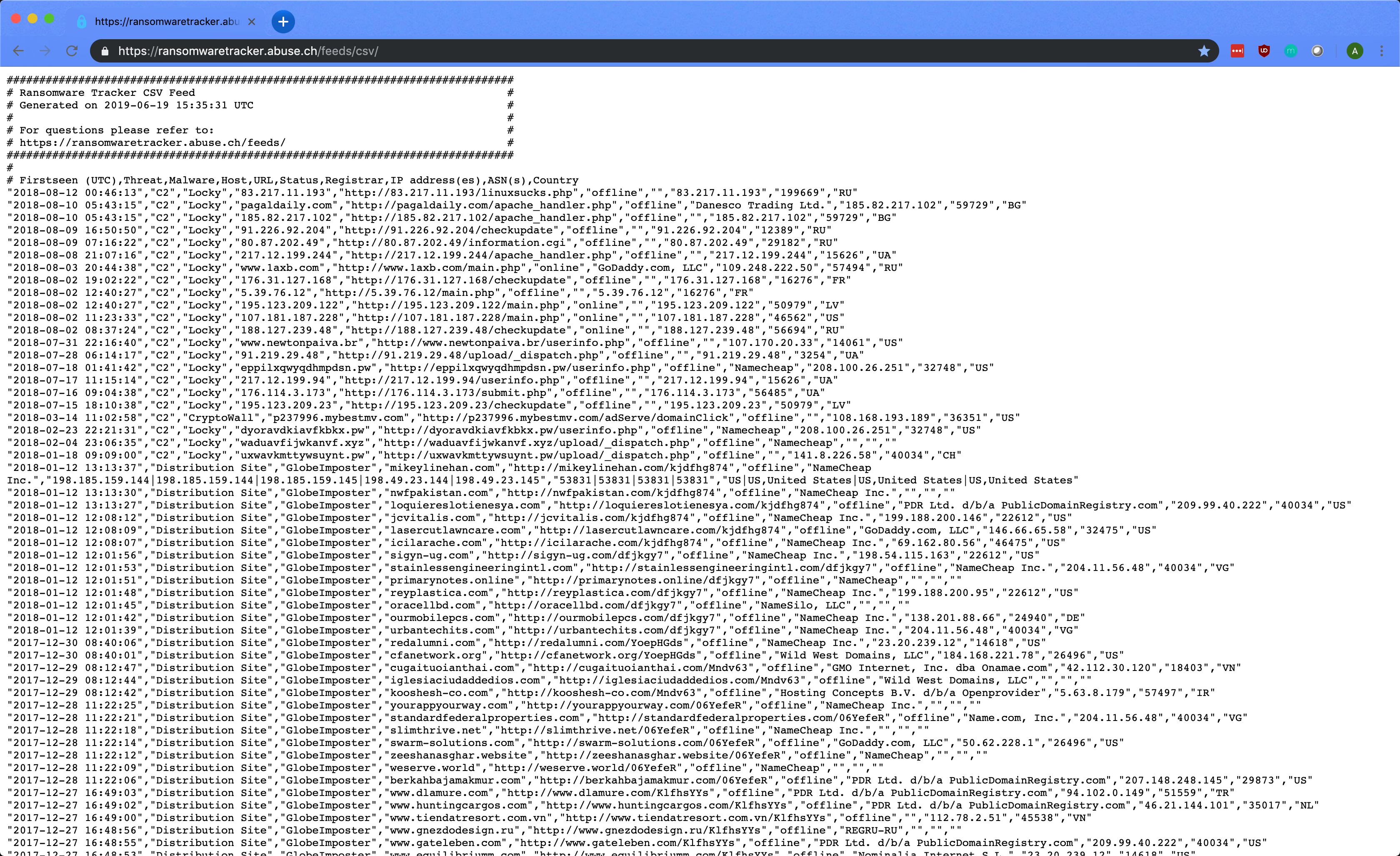
The most interesting feature of Ransomware Tracker is the availability of a feed in the CSV (Comma Separated Values) format which allows us to easily capture and utilize this intelligence.
The screenshot below shows the Ransomware Tracker data in its raw CSV format accessible via the URL - https://ransomwaretracker.abuse.ch/feeds/csv/
Our objective is to read, parse, and generate insights from this Ransomware Tracker data using Python with Pandas.
Getting Started
For the purpose of this tutorial, we will use a Jupyter Notebook to write Python code and produce output. Here is a complete, easy to understand introduction to Jupyter Notebooks and how to get started.
The first step is to fetch the data.
As mentioned earlier, our data resides online as a CSV document. Pandas provides us with the read_csv function to read CSV data and store it into a DataFrame structure.
import pandas as pd
url = "https://ransomwaretracker.abuse.ch/feeds/csv/"
df = pd.read_csv(url, skiprows=8, encoding="latin-1")
We start by importing the Pandas module and reference it as pd instead of pandas. This is a personal preference but is commonly seen in tutorials online.
Next, we initialize a variable url with the Ransomware Tracker CSV URL. This variable has a data type of str.
Finally, we make a function call to pd.read_csv with arguments as follows
url- location where our CSV feed resides (required)skiprows- number of rows to skip from the top of the CSV document (in our case the first 8 lines are comments)-
encoding- text encoding to be used
Now, we have df (our DataFrame) with the data loaded from the URL. Let us validate the data and its structure.
df.shape
# (13866, 10)
df.head()
df.head() prints the first 5 rows of the DataFrame by default. You can change this by specifying the required number of rows as an argument. Hence, df.head(n) will print the first n rows of the DataFrame.
Next, we validate the bottom values of the DataFrame. This is good practice for large datasets such as Ransomware Tracker with over 13,000 rows of data.
df.tail()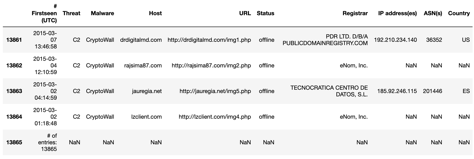
In our output, we can confirm the following facts:
- The DataFrame recognized the header names
- All fields are parsed correctly and unavailable fields are replaced with
NaNvalue - The last row is a comment and needs to be removed
To remove the last row of the DataFrame, we can use a simple one-liner from Pandas:
df.drop(df.tail(1).index, inplace=True)
df.tail()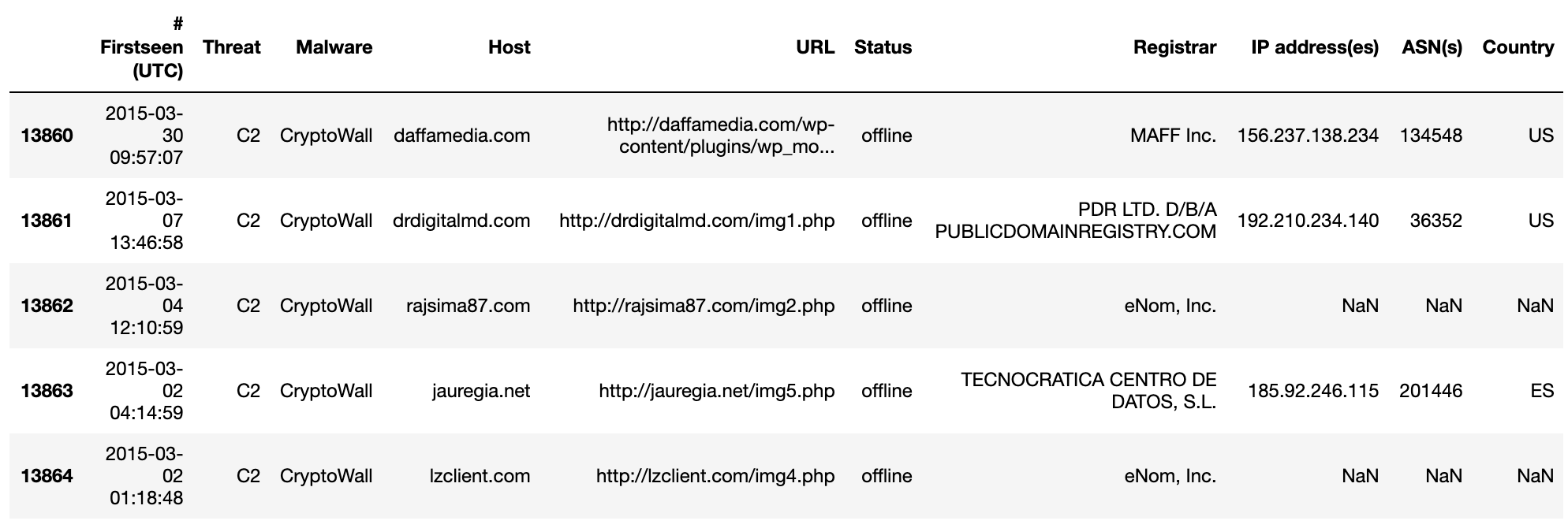
Great!
Now, the df.shape command should return (13865, 10) since we removed the last row of the DataFrame.
Data Transformation
The next step involves manipulating and transforming the data in our DataFrame.
Let’s start with fixing the header names (also known as column names) of the DataFrame. To do this, we start by retrieving the list of existing header names.
list(df.columns)
'''
['# Firstseen (UTC)',
 'Threat',
 'Malware',
 'Host',
 'URL',
 'Status',
 'Registrar',
 'IP address(es)',
 'ASN(s)',
 'Country']
'''
I decided to make the DataFrame easier to read and comprehend with the following header name changes.
- Old:
# Firstseen (UTC) - New:
Firstseen - Old:
IP address(es) - New:
IPs - Old:
ASN(s) - New:
ASNs
To accomplish this, we can use the df.rename function as follows.
columns = {'# Firstseen (UTC)': 'Firstseen', 'IP address(es)': 'IPs', 'ASN(s)':'ASNs'}
df = df.rename(columns=columns)
df.head()
The Firstseen column in our DataFrame can provide us with a treasure of knowledge.
However, the values available consist of a date and time. We simply want the date. This requires a transformation of the values in the Firstseen column in our DataFrame.
Before we apply the solution in the context of the DataFrame, let us shift perspective. Consider a value from the Firsteen column. For example - 2018-08-12 00:46:13
s_dt = '2018-08-12 00:46:13'
type(s_dt)
# str
The goal is to transform this value into our desired format. I choose to change the format to 12-08-2018. How can we do this?
Python provides us with a useful module called datetime for this exact purpose. We can leverage the datetime.strptime function to convert s_dt (a str object) to a datetime object as follows.
import datetime
o_dt = datetime.datetime.strptime(s_dt,'%Y-%m-%d %H:%M:%S')
type(o_dt)
# datetime.datetime
Now, we construct our desired format DD-MM-YYYY using the datetime.strftime function and o_dt (the datetime object) as follows.
s1_dt = o_dt.strftime("%d-%m-%Y")
s1_dt
# '12-08-2018'
type(s1_dt)
# str
Easy! We successfully transformed one string but what about an entire DataFrame column?
To achieve this, we can use the df.apply function which applies a function along an axis of the DataFrame. For the function aspect, I choose to construct a lambda function (popularly known as anonymous functions).
df['Firstseen'] = df['Firstseen'].apply(lambda x: datetime.datetime.strptime(x,'%Y-%m-%d %H:%M:%S').strftime("%d-%m-%Y"))
df.head()
Voila! Let us dissect the above command…
df['Firstseen'].apply(lambda x: datetime.datetime.strptime(x,'%Y-%m-%d %H:%M:%S').strftime("%d-%m-%Y"))Here:
df['Firsteen']refers to the columnFirstseenin the DataFramedflambda x: datetime.datetime.strptime(x,'%Y-%m-%d %H:%M:%S').strftime("%d-%m-%Y")is our lambda function.- The
xinlambda xreferences each element in theFirstseencolumn. datetime.datetime.strptime(x,'%Y-%m-%d %H:%M:%S')converts eachx(strobject) to adatetimeobject using the provided format.strftime("%d-%m-%Y")then converts eachdatetimeobject back tostrin the provided format (DD-MM-YYYY).
- The
- We apply this lambda function across the entire
Firstseencolumn usingdf.applyfunction
The biggest takeaway is to always achieve the desired transformation at the element-level before attempting to manipulate the DataFrame.
Querying
The next step is to query the DataFrame and generate valuable insights. In this step, I aim to use Pandas to perform operations on the DataFrame, extract output, and visualize the results.
Query 1: Number of entries per threat
In this query, we want to categorize our dataset based on the Threat field. This basically involves a group by operation followed by aggregation and sorting. I write the query as follows.
df.groupby('Threat').size().sort_values(ascending=False)
'''
Threat
Distribution Site    11297
Payment Site          1660
C2                     908
dtype: int64
'''
Interesting! The output indicates the existence of 3 threats - Distribution Site, Payment Site and C2 (Command and Control Site). As seen in the Python query, we utilize a variety of Pandas functions to manipulate the data.
Now, how about a visualization?
Visualization of data in Python can be achieved with a variety of libraries such as Matplotlib, Seaborn, and ggplot. Read more here.
Pandas comes with an in-built df.plot function exposing useful plotting abilities. In fact, df.plot basically refers to Matplotlib in the backend for visualization.
Let’s create a simple horizontal bar graph to illustrate the different categories of threats and their counts. The query is as follows.
df.groupby(['Threat']).size().sort_values(ascending=False).plot(kind='barh')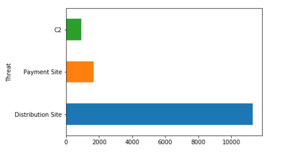
The df.plot function is an effective tool to generate useful graphs. In our simple example above, we specified the argument kind=barh to indicate a horizontal bar graph.
Query 2: Yearly trend in malware
For the next query, I decided to play with the Firstseen field of the DataFrame. A valuable tip is to always attempt trend analysis if the dataset contains date/time fields.
This query is slightly more complex as compared to the previous one. The first transformation involves creating a new DataFrame column called Firstseen_year in which the “year” from the Firstseen element is captured and stored. We accomplish this by using a custom defined lambda function.
df['Firstseen_year'] = df['Firstseen'].apply(lambda x: datetime.datetime.strptime(x,'%d-%m-%Y').strftime("%Y"))Before we continue, let us understand the dtypes or data types of elements within our DataFrame using the following command.
df.dtypes
'''
Firstseen         object
Threat            object
Malware           object
Host              object
URL               object
Status            object
Registrar         object
IPs               object
ASNs              object
Country           object
Firstseen_year    object
dtype: object
'''
As seen above, all the elements are of object data type which is equivalent to str data type in Python. When working with date/time elements, it is strongly recommended to ensure a suitable data type. This especially matters for operations such as sorting.
One mechanism to change the dtype of a column is to use the df.astype function as follows.
df['Firstseen_year'] = df['Firstseen_year'].astype('datetime64[ns]')
df.dtypes
'''
Firstseen                 object
Threat                    object
Malware                   object
Host                      object
URL                       object
Status                    object
Registrar                 object
IPs                       object
ASNs                      object
Country                   object
Firstseen_year    datetime64[ns]
dtype: object
'''
Great! Our DataFrame column Firstseen_year now has data type as datetime64[ns].
Although this is the correct way to work with date/time elements, it is important to note that side-effects are plenty. Let us take a look at the contents of the DataFrame df.
df[['Firstseen','Firstseen_year']].head()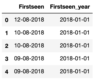
As we can see, once we extract 2018 from 12-08-2018 and convert it to the datetime64[ns] data type, we end up with 2018-01-01.
While it makes sense… it does not meet our desired format i.e., year only. This means that we absolutely require 2018 instead of 2018-01-01 and the like. But how?
Simple!
Since df['Firstseen_year'] is of the data type datetime64[ns], we can extract the “year” part of the date/time object as follows.
df['Firstseen_year'] = df['Firstseen_year'].dt.year
df[['Firstseen','Firstseen_year']].head()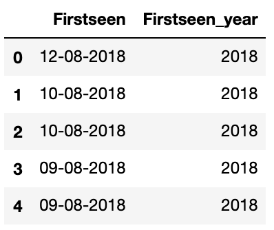
Wait, what about the data types?
df.dtypes
'''
Firstseen         object
Threat            object
Malware           object
Host              object
URL               object
Status            object
Registrar         object
IPs               object
ASNs              object
Country           object
Firstseen_year     int64
dtype: object
'''
As we can see, Firstseen_year column has int64 values. Now, operations such as sorting can be achieved accurately. Back to the query!
ax = df[['Firstseen_year','Malware']].groupby('Firstseen_year').count().sort_values(by='Firstseen_year', ascending=False).plot(kind='area', figsize=(20,5))
ax.set_xlabel("Firstseen Year")
ax.set_ylabel("Number of Malware")
ax.set_title("Yearly Malware Trend - Ransomware Tracker")
The above query includes many useful features of the df.plot function. This is an example of an area graph. The figsize=(20,5) argument indicates the size of the graph produced as output.
No graph is complete without appropriate x and y labels. The set_xlabel and set_ylabel functions play a significant role in helping us define these labels.
Query 3: Number of malware per threat per year
For the next query, I decided to focus on a slightly more complex query. This time, I decided to utilize two fields - Firstseen_year and Threat.
To achieve this query, we simply require two group-by instructions followed by aggregation.
df.groupby(['Firstseen_year','Threat']).size()
'''
Firstseen_year  Threat
2015            C2                      37
2016            C2                     709
                Distribution Site    10441
                Payment Site          1346
2017            C2                     140
                Distribution Site      843
                Payment Site           314
2018            C2                      22
                Distribution Site       13
dtype: int64
'''
The insights generated here is extremely valuable. Finding correlations between different columns and fields is typically achieved using the df.groupby function. Visualizing the results would be the icing on the cake!
Let’s visualize the data as follows.
ax = df.groupby(['Firstseen_year','Threat']).size().unstack().plot(kind='area',stacked=True,figsize=(20,5))
ax.set_xlabel("Firstseen Year")
ax.set_ylabel("Number of Malware")
ax.set_title("Malware per Threat per Year - Ransomware Tracker")
The above query showcases an area plot described by kind='area' as argument to the function df.plot. The stacking is achieved with the argument stacked=True and makes the graph easier to visualize.
Again, we utilize the set_xlabel and set_ylabel functions to correctly label the graph. This is always recommended!
Conclusion
In this tutorial, we explored Pandas - the defacto Python module in a Data Analyst’s toolkit.
Using the practical example of Ransomware Tracker data, we went through the steps involved in ingesting, cleaning, parsing, querying, and visualizing data to generate powerful insights.
You can view and download a Jupyter Notebook with everything highlighted in this tutorial from here.
Key takeaways include:
-
Always be curious about data. In Cyber Security, we are surrounded by tons of valuable data - logs, threat intelligence, etc. You never know what you will find.
-
Leverage modern technologies such as Python, Jupyter Notebooks, GitHub, etc. to write code, visualize graphs, and share with others.
-
Within Python, explore numerous visualization libraries and modules such as Seaborn, Plotly, Bokeh, Matplotlib, etc. Depending on the scenario, one of them could provide much more value over the other.
-
Try to correlate with various datasets. For more advanced analytics, play with multiple datasets. In our example, we used only one dataset - Ransomware Tracker feed. In the real-world, you might face multiple datasets. As challenging as it sounds, the reward (insights generated) are usually worth it.
I hope you enjoyed reading this. Please email me with questions.